Louise Trotter’s Milan presentation turns seasonal dressing into a study of space, movement and visible craft, with the commercial test still to come.

A summer collection built around the space clothes leave
Bottega Veneta has made lightness the central proposition of its Summer 2027 collection in Milan. Louise Trotter’s September 26 presentation explored the transition from protective layers to a more open relationship between clothing and the body. The collection text published by Avenue Montaigne on September 27 describes that movement through relaxed but precise cutting, supple leather and an emphasis on the visible work of the hand.
The concept is more specific than a general promise of easy dressing. It asks how a house associated with material richness can create a sense of air without surrendering its identity. Lightness can mean reduced physical weight, less visual density, more room around the body or greater freedom of movement. Those qualities may coincide, but they are not identical. A runway can suggest some of them; only handling and wearing a finished garment can establish others.
The published show images make the distinction tangible. In one finale photograph, a pale shirt sits above a skirt of loose lilac strands, while a vivid blue hat supplies a concentrated point of colour. Nearby, a long grey outer layer retains coverage without creating the same visual effect. The contrast is not simply between winter and summer items. It is between different ways of letting a silhouette remain complete while its surface becomes less closed.
This is a review and analysis of the published collection material, not a report from a backstage inspection or a claim to have tested the clothes. That boundary matters for a collection whose appeal rests heavily on texture and movement. Images can show proportion, layering and the relationship among looks. They cannot establish comfort, garment weight, production consistency or how a delicate detail will behave after repeated use.
A familiar house code, translated rather than discarded
According to Kering’s history of the house, Bottega Veneta was founded in Vicenza in 1966 and introduced its Intrecciato leather weave in 1975. The group identifies that construction as a visual and tactile signature and records Trotter’s arrival as creative director in 2025. Those references explain the design problem: a new collection needs to be recognisable without reducing the house to an endlessly repeated surface pattern.
A signature can operate in several ways. It can be reproduced literally, enlarged until it becomes a graphic statement or translated into a broader idea about how elements connect. The latter route is more flexible but also more difficult to explain. If everything is described as weaving, the term can become a metaphor without much technical content. The persuasive version is one in which the relationship between structure and appearance can still be understood.
For Summer 2027, the relevant tension is between continuity and subtraction. Removing visual mass does not require removing the evidence of construction. A garment can draw attention to the arrangement of its parts through openings, drape or the way an edge moves. That gives a craft-led house another route to visibility: the viewer notices what the material does, rather than only how much material or ornament has been added.
The commercial advantage of a recognisable design language is that it can connect products across seasons. The creative risk is that recognition becomes the entire purpose. A collection needs more than confirmation that familiar codes are still present. Here, the interesting question is whether those codes can support a different bodily experience, allowing the same house vocabulary to describe an outfit that feels less enclosed and less dependent on solidity.
Lightness is an aesthetic claim before it is a measured one
The collection notes describe leather as exceptionally light, but no comparative garment weights or performance tests accompany that language. It is therefore a creative description rather than a quantified technical result. That does not make it meaningless. Fashion communicates through sensation and appearance as well as measurement. It does mean that reporting should avoid converting an evocative phrase into a claim that a material has achieved a verified new standard of performance.
Visual lightness can come from proportion alone. Exposing more of the space around the body, separating layers or allowing an edge to move can change how an outfit reads even when its materials remain substantial. Colour can contribute as well, though a pale garment is not necessarily lighter in either weight or construction than a dark one. The distinction helps explain why a collection can create a coherent mood through quite different garments.
Physical lightness introduces other questions. Reducing thickness or adding open areas may alter the way a garment hangs, how it needs to be supported and how it is finished. Those are construction considerations, not evidence of a flaw in these particular pieces. The important point is that subtraction is not automatically simpler than accumulation. A convincing result may require decisions that become less visible precisely because the garment looks effortless.
That is why the collection’s proposition is most useful when understood as a design inquiry rather than a technical boast. It directs attention to the relationship among mass, coverage and movement. Whether the finished clothes deliver the same impression in ordinary settings will depend on details that the runway does not fully disclose: fit, lining, fastening, balance and the way the material responds to the wearer.
The silhouette is doing as much work as the surface
The finale photographs published with the collection text show several ways of moving volume away from the body. An oversized pale jacket sits above a dark pleated skirt; elsewhere, dark fabric falls in an extended drape rather than a compact outline. These are observations of the images, not claims about the unseen interior construction. Their shared effect is to make the boundary of the garment appear less fixed as the models move.
That approach changes where attention settles. A rigid outline directs the eye toward a stable shape. A loose layer asks the eye to follow a sequence: where fabric begins, where it gathers and where it is released. The result can be expressive without requiring a large printed motif. It also makes movement part of the design rather than a secondary effect visible only after the outfit has been assembled.
The potential difficulty is proportion. Generous volume can create ease, but it can also obscure the person wearing it if the balance is not carefully managed. A runway model, a controlled pace and a particular shoe can make a combination appear resolved under conditions that differ from daily use. The collection’s most transferable ideas may therefore be relationships among pieces rather than a requirement to reproduce every complete look exactly.
That distinction is familiar to readers who use shows as a source of ideas rather than shopping instructions. A looser jacket, a more open neckline or a contrast between a quiet upper layer and a mobile lower one can be considered separately. The point is not to declare a universal formula for dressing. It is to identify the design decisions that remain legible when the spectacle of the runway is removed.
Woven leather is not interchangeable with woven cloth
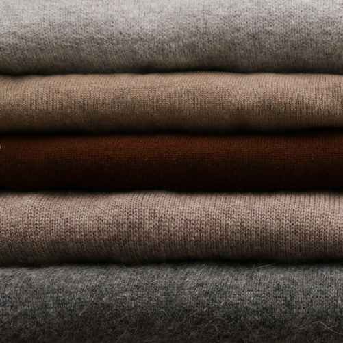
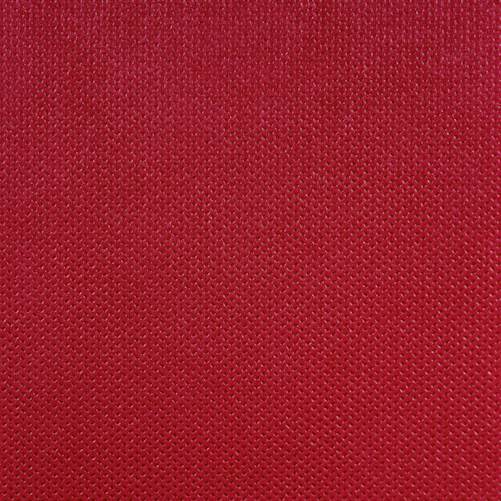
Intrecciato gives Bottega Veneta a vocabulary rooted in leather, but the wider idea of interlacing materials should not erase their differences. A textile close-up, including the illustrative image accompanying this article, is not evidence of a particular leather technique or of the materials used in this collection. It is a thematic reference to construction. The distinction is necessary because similar-looking surfaces can be made through different processes and behave differently in use.
Scale is one of the variables that changes their appearance. A fine repeated structure can read as a continuous surface at a distance; a larger structure makes the individual elements more visible. Open areas can turn the background or the layer beneath into part of the composition. These are visual principles rather than claims about an undisclosed manufacturing process. They explain why a familiar motif can produce different effects without ceasing to be recognisable.
The treatment of edges matters just as much. A viewer may notice the main pattern first, but the way it ends or meets another part of the garment can determine whether the whole looks deliberate. This is one reason close examination is important when craft becomes the central selling language. An attractive surface in a photograph does not reveal every junction, fastening or finish that contributes to the finished object.
The collection’s emphasis on lightness makes those transitions particularly relevant. A dense construction can conceal some supporting decisions within its mass. A more open or mobile one may expose them. That can create a direct visual account of how the piece is made, but it also raises the standard for the less dramatic details. The success of the idea depends on the whole object, not solely on the most photographed area.
Colour interrupts the argument for restraint
The collection is not simply an exercise in muted luxury. The published finale includes a strong blue headpiece, a pale yellow shirt and a lilac fringe-like skirt. Those colours create a different reading from the dark, draped looks shown elsewhere. They make lightness feel active rather than withdrawn. The visual contrast is important because an emphasis on craft can otherwise be mistaken for an instruction to remain discreet.
A concentrated colour can organise an outfit without spreading across every element. In the photograph, the hat provides a small, definite shape above a much looser field of movement. The difference between a compact accent and a mobile lower layer gives the composition rhythm. That is an interpretation of the image, not evidence that the house intended every viewer to follow the same sequence or attach the same meaning to the colours.
Colour also changes how detail is perceived. A subtle construction may be easier to inspect in a quiet tone, while a vivid shade can initially dominate the eye. Designers can use that tension to delay or accelerate recognition of the craft beneath the surface. The viewer may first see a block of colour and only later notice its structure. This gives a collection more than one point of entry.
The practical implication is not that a particular shade has become compulsory for the next season. A single presentation cannot establish a market-wide trend, and no consumer preference data have been released with these images. What can be said is narrower and more useful: the collection uses colour and construction as complementary tools, showing that a craft-centred identity does not require every look to communicate through understatement.
Movement reveals information that a still image withholds
The collection page links to the house’s runway film, while the finale photographs preserve only selected moments. That difference matters for garments whose outlines change with motion. A still frame can catch an unusually wide swing of fabric or conceal a detail behind another layer. It can establish that a feature exists, but not how often it appears or how it behaves through an ordinary sequence of movement.
A critical reading should therefore distinguish the image from the object. The photograph has its own composition, angle and timing. The garment has a construction that continues beyond the frame. Describing the apparent effect of a photograph is legitimate, but it should not become an unqualified statement about comfort, durability or the experience of wearing the piece. Those require different kinds of evidence.
This is especially relevant to details such as loose strands, extended hems and substantial drapes. Their visual appeal may depend partly on movement, but everyday use includes sitting, carrying objects and negotiating limited space. None of that makes the design impractical by definition. It means the appropriate test is broader than a controlled walk across a clear floor. The runway proposes a possibility; use establishes its limits and pleasures.
The distinction also leaves room for the customer rather than treating the show as a fixed instruction. Some people may value a dramatic silhouette precisely because it is reserved for particular occasions. Others may adapt one element to a more ordinary wardrobe. Fashion’s expressive purpose does not require every piece to solve the same practical problem. It does require clarity about what kind of experience a design is offering.
Visible handwork is a description, not a blanket quality guarantee
The collection’s language gives a place to the visible hand and to variation in a gesture. That is an aesthetic position: it asks the viewer to notice evidence of making rather than an entirely anonymous surface. It should not be confused with the claim that every irregularity proves superior quality. A variation can be intentional, incidental or undesirable. Understanding which requires knowledge of the design and the standard to which it is produced.
Craft is most informative as a description of specific work. It can refer to cutting, assembling, finishing, shaping or selecting materials. Used without those details, the term risks becoming a general synonym for expensive. Used precisely, it helps explain why a particular result is difficult to achieve and what a customer is actually paying for. The distinction is particularly important when the final appearance is deliberately relaxed rather than visibly elaborate.
An apparently simple object may contain a demanding sequence of decisions, while a complicated-looking one may rely on a highly repeatable process. Appearance alone does not reveal the full production story. That does not prevent criticism or appreciation; it sets the boundary between them and a manufacturing claim. The published collection material supports discussion of the design language, but it does not provide an independent audit of every step in production.
The most convincing craft narrative consequently connects the visible result to verifiable information. Material descriptions, construction explanations, repair provision and clear care guidance can extend what the show communicates. They allow the relationship with the object to continue after the initial image. Without that connection, the language of making can remain emotionally effective while giving the customer little practical knowledge about the item itself.
Training gives the craft narrative an institutional dimension
Bottega Veneta’s Accademia Labor et Ingenium provides a more concrete reference than a general appeal to heritage. The house describes it as a permanent workshop where new employees and external students learn from master artisans, with further training for existing staff. The programme is not new to this runway presentation. It is part of the existing infrastructure through which the company says it develops and transfers skills.
The significance is organisational. A collection can introduce a new silhouette in one season, but the ability to make it consistently depends on people whose knowledge develops over a longer period. Training creates a possible bridge between a creative idea and repeatable production. It does not prove that every garment is successful, but it makes the question of craft more tangible by identifying a place and process for learning.
Skill transfer also changes the meaning of continuity. A house does not preserve its identity only by keeping old designs in an archive. It preserves ways of judging proportion, handling materials and solving construction problems. Those methods can be applied to a new idea rather than used solely to reproduce an old one. In that sense, the capacity to change may depend on the quality of what has been retained.
There are limits to what the public description establishes. It does not provide evidence about the number of graduates working on this collection, productivity gains or the relative contribution of different teams. Such figures should not be inferred. The defensible point is narrower: the house has a named training structure, and a collection centred on making should be considered alongside the institutions that sustain that making.
Seasonal transition is not the same as disposable novelty
The idea of moving between seasons gives the collection a temporal structure, but it does not require the clothes to expire when the season changes. A runway calendar introduces new work at a particular moment; a wearer can use an object for much longer. The relationship between those timeframes is one of fashion’s persistent tensions. A collection can feel current without making a credible claim that everything preceding it has become irrelevant.
Layering is one way to negotiate that tension. An open piece may be worn over something more substantial, while an outer layer can be removed as conditions change. The interest lies in the relationship among pieces rather than in a single prescribed temperature or location. The show’s seasonal narrative is therefore useful as a way of thinking about adaptation, although it does not establish how any particular garment performs in heat or cold.
A wardrobe also operates through repetition. A distinctive item may be combined with familiar pieces many times, acquiring a meaning different from the complete runway look. That possibility is particularly relevant to a house with recognisable material codes. A customer need not adopt the whole collection to participate in its language. A change in proportion or surface can be enough to alter the relationship with clothes already owned.
None of this should be turned into an automatic sustainability claim. Long use depends on construction, care, repair, changing preferences and the circumstances of ownership. A timeless-looking object is not necessarily used for a long time, and an expressive one is not necessarily discarded quickly. The collection offers a design proposition; evidence about environmental performance and actual longevity would have to come from elsewhere.
Longevity needs information beyond the runway
When a garment depends on an unusual surface or an open structure, care information becomes part of the product rather than an afterthought. A customer needs to know how it should be stored, cleaned and handled, and what options exist if a detail is damaged. These are questions to ask about the finished retail item, not indications that the collection has a known defect or that one material is categorically unsuitable.
Repairability is similarly specific. Some problems can be addressed locally, while others may require particular materials or knowledge held by the maker. A general statement that a house values craft does not establish the repair terms for every category. Clear information about availability, cost and limits would help customers distinguish an ongoing service relationship from a promise that applies only to selected products.
There is also a difference between preserving appearance and preserving function. A visible repair may alter an object’s surface while allowing continued use. A technically discreet repair may be difficult or expensive. Customers may make different choices about those outcomes. A meaningful account of longevity leaves room for them instead of assuming that the only acceptable object is one that never shows age or change.
For fashion reporting, the consequence is straightforward: the suggestion of lightness and the suggestion of durability should not be collapsed into one. A delicate-looking piece can be well made, and a solid-looking piece can still require careful handling. The evidence needed to judge those qualities is different from the evidence needed to discuss silhouette. Keeping them separate makes both the review and the eventual buying decision more precise.
The shop floor will ask different questions from the runway
A show assembles selected looks under controlled conditions. A retail collection must offer a range of sizes, combinations and uses. The published presentation does not establish which pieces will be produced in which quantities, at what prices or with what adjustments. Any claim that the collection is already a commercial success would therefore be premature. The sales test lies ahead of the creative statement.
Buyers and customers may respond differently to the same feature. A memorable runway piece can create attention while a less dramatic item becomes easier to incorporate into a wardrobe. That is not necessarily a contradiction. A collection can perform several roles: establish a direction, make a signature visible and supply objects that work individually. The important question is whether those roles reinforce one another rather than produce a gap between the image and the available product.
The material emphasis makes in-person presentation especially relevant. Touch, weight, movement and the quality of a finish are difficult to communicate fully through a screen. A strong retail explanation could connect those qualities to the collection’s concept without simply repeating its language. It would show what changes when the customer lifts, wears or compares the item, while being clear about information that remains a matter of individual preference.
Prices will also shape that encounter, but no price assumptions are necessary to understand the design. Value is not established solely by a luxury label or by the number of visible details. It emerges from a relationship among the object, its making, its use and what a particular customer wants. Reporting should not substitute an imagined consumer response for the evidence that will become available as the collection reaches the market.
Recognition does not have to depend on a conspicuous logo
Kering’s account of Bottega Veneta’s early identity emphasises supple bags without heavy hardware or a prominent logo. That history helps explain why construction can carry the burden of recognition. A repeated material language can identify a house to people familiar with it while remaining less explicit to everyone else. This is not the absence of branding; it is branding expressed through form, texture and accumulated familiarity.
Such a system has a different creative challenge from a printed emblem. A logo can be applied to many objects without changing much. A construction-based identity needs to be adapted to each object’s purpose and shape. That can create richer design possibilities, but it also makes translation more demanding. The result should make sense as a garment or accessory, not merely as a place to display a recognisable technique.
Summer 2027’s emphasis on openness tests that relationship. If the house code remains legible when visual density is reduced, it can operate beyond a single solid surface. If it disappears entirely, the collection risks becoming a general mood that could belong elsewhere. The interesting middle ground is one in which the signature is present but not the only thing the wearer or viewer notices.
That does not establish a superior model for every luxury brand. Different houses organise recognition through different histories and methods. The point is specific to this collection: its creative proposition depends on retaining enough structural identity for a lighter expression to remain meaningful. The tension is between a code that can evolve and a motif that is simply repeated.
The show can be read without declaring a universal trend
Fashion-week coverage often moves quickly from a collection to a prediction about what everyone will wear. The available evidence supports a more limited conclusion. Bottega Veneta has presented a particular interpretation of summer under its current creative director. It does not follow that every customer, region or price category will adopt the same balance of volume, colour and exposed structure.
Nor does one collection resolve the broader argument about minimalism and ornament. The images contain both quieter surfaces and more conspicuous movement. Their interest lies partly in that coexistence. A spare outline can sit beside a more elaborate one without requiring a declaration that one entire aesthetic has defeated another. Treating a show as a set of relationships can be more revealing than forcing it into a binary trend label.
The distinction is useful commercially as well. An idea can influence styling, proportions or presentation without producing direct demand for the exact runway object. A buyer might respond to a colour relationship or the way layers are separated. Those forms of influence are harder to measure than a sell-out headline and should not be invented in advance. They remain possibilities to observe as the season develops.
For now, the specific contribution is clear enough: the collection asks a materially rich house to express itself through less enclosure. That is a coherent design question, whether or not a viewer prefers every answer. It gives the presentation a subject beyond novelty and provides a basis for judging the eventual products on their own terms.
A proposal that will become clearer in the wearing
The most useful distinction after the Milan show is between what has been presented and what remains to be experienced. The collection’s images and published explanation establish a direction: more space, more movement and a visible relationship with craft. They do not establish a complete account of fit, maintenance or commercial performance. Those later tests need not diminish the creative statement; they determine how far it travels beyond the runway.
Trotter’s presentation gives that statement a recognisable framework rather than starting from an empty page. The house’s established language of interlaced material and its documented investment in skills provide context. The new question is how that language behaves when it is asked to feel less protective and more open. The result is best understood as a translation of identity, not a claim that identity has been abandoned.
For the viewer, the collection rewards attention to relationships: a compact accent above a moving layer, an extended drape beside a quieter surface, an open structure against the body or another garment. Those are observable design decisions rather than proof of a market-wide shift. They make it possible to discuss the work precisely without relying on celebrity attendance, unsupported sales forecasts or a declaration that a single show defines the season.
Summer 2027 offers Bottega Veneta a clear proposition to carry into its next retail cycle. The craft is asked to remain legible while the clothes create room around the wearer. Whether that room feels as convincing in daily life as it does in the published images is the next question. The runway has supplied the idea; the finished object and the person wearing it will supply the more lasting answer.